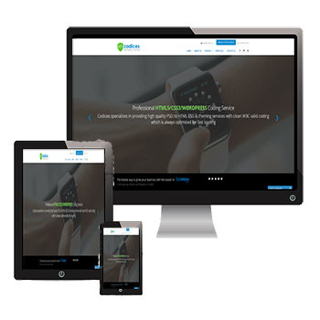
PSD TO RESPONSIVE HTML
Our PSD to Responsive services provides you a single website fits to all devices
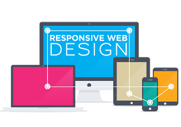
PSD TO RESPONSIVE HTML
The advance technique of web designing aimed to adjust with every screen allowing web pages to be observed in response to the size of the device one is viewing with is called responsive web designing. Codices technologies provide the best responsive services that allow the adaption of the layout to the viewing milieu of any site with responsive designs. By using fluid proportion based grids and flexible images, we help the websites to become more user friendly adapting for view in all types of gadget's screen.
Flexibility gaining popularity
The importance of responsive web design has increased as the amount of mobile traffic has occupied more than half of the total internet traffic. People using different devices and thus every website needs to be flexible enough to be viewed on all types of devices and on its screen maintaining its original clarity. The concept of fluid grid helps the page elements for sizing relative to percentages. The flexible images are also made in size in relative units preventing them to display disorderly. Codices technologies as always dedicated to the interests of the clients and help them to design their websites in the responsive manner that will provide the website chance to reach the total market through any kind of devices smoothly.
Feel free to get connected with us through our shared details.
Our superiority in the Responsive field
Responsive web designs
The basic purpose of Responsive web design is to produce websites and applications smartly with flexibility to resize and adapt the contents based on the screen size of any device while maintaining its clarity and resolution. This boosts the development speed and makes the projects manageable by increasing its usability.
Application development services
Our Responsive web designs are built on modern HTML5 and CSS enabling the characteristics of media queries identifying a browser resolution. Elements and contents get adjusted automatically making the design fluid to fit into different dimension and window size without any break.
Migration of fixed layout
Our experienced services make migration of fixed web layout, web applications and websites to Responsive layout easy as our professionals have the acquaintance about the proper techniques.
Web design implementations
Knowing the purpose carefully and correct implementations based on it, is a necessary point that should be under strict attention. Our experts design smart website and masters on the correct implementations of the same.
Responsive UI development
The aim of Responsive development is to adapt to any screen size of any device. The UI guidance includes flexible grid that confirms consistency layouts, breakpoints details allowing the contents to reflect on different screens with same stylish clarity.
Fluid width
With our Responsive services, past are those days when you had to worry about breaking your website according to the screen size of any new device. We use a grid based on fluid percentages and thus maintain the clarity of the website in any form of devices.
Responsive menu
We offer a highly customizable Responsive Menu plug in for WordPress. Over hundreds of modified options are available in our menu bar providing thousands of combinations possibilities.
Designed for four corners
Our designed resultants are not only for specific device's screen but for the four corners of screens that includes all the devices available in the market. This provides a future proof to the products.
Our exceptionality in the Web Industry
- We maintain a high standard in our services providing our clients 100% satisfaction.
- Our services make the websites popular and user friendly leading the rise of E commerce of our clients.
- Our Responsive services have improved according to the latest version to adjust it with any devices.
- Making life of common people easier with Responsive flexibility.
- Our expertise not limits itself to our services but in maintaining the trends and working on the modern demands with latest technology.
Why will you prefer to hire us?
The importance of responsive web design has increased as the amount of mobile traffic has occupied more than half of the total internet traffic. People using different devices and thus every website needs to be flexible enough to be viewed on all types of devices and on its screen maintaining its original clarity. The concept of fluid grid helps the page elements for sizing relative to percentages. The flexible images are also made in size in relative units preventing them to display disorderly. Codices technologies as always dedicated to the interests of the clients and help them to design their websites in the responsive manner that will provide the website chance to reach the total market through any kind of devices smoothly.
Feel free to get connected with us through our shared details.
We are in a continuous study of improving our services and follow the latest versions of Responsive designing resulting in the best and modified results. Our modified technology proves to be the best in the industry.
We understand the basic of our clients and the purpose for what the website and application will be designed. We work according to it providing an exclusive touch by customizing the Responsive products and our services bring that freshness that could attract the market.
When we design and develop for you, then you will definitely get a user friendly result that will further provide a smooth experience to your visitors. With new age excellence we are ready with confidence. No other can provide what we deliver to our clients.
We know the usage of our techniques and development tools and smartly apply them on the accurate spots. Our smart Responsive relevance is been proven now to be the best and we thus provide our clients with the top services in the industry.